
Or How We Started to Fear the Blank Canvas
Why the tools we use every day got easier to start and harder to grow into
I've spent most of my days as a maker who sells what he makes as an interface designer. Even before I had any grounding in print design, through early contact with computers and software like Pajączek 2000 (a Polish HTML editor) and Notepad++, my friends and I were building simple static .html pages. Magic portals called iframes ruled, and every kind of ornament, from the marquee tag to falling-snow effects and animated cursors, impressed our young heads. Pretty much from the moment I started earning money designing flyers, business cards and brochures, websites were on the menu too, and local businesses didn't see them as any different from flyers. Some of them understood that a website on its own can at most carry information. Its promotional value was tied to search results and ad campaigns. To this day, simply having a page with your rules and prices is worth a lot, and it's worth even more now that information has become so layered and shredded for the ordinary user: the restaurant menu only as photos on Google Maps, the menu only in a Facebook gallery, the current opening hours only on Twitter.
A physical flyer can look like an interface with very simple, limited interaction: I pick it up, unfold it, read it, throw it away or keep it. You can complicate anything, of course, and add some spice, but let's stay in everyday reality for now. With a website, and let's stay with a local business's website for now, it isn't that obvious.
Stone Tablets of the Early Web, Eastern European Edition
I remember pages loading over a dial-up connection, and how basic they were, though even then you could stumble onto whole image galleries, ambitious home pages and bigger services. The first three uses of the internet I came across were IRC and chat rooms, stealing and emulating media, and internet forums: small local communities as well as huge themed behemoths with many active groups and every topic imaginable.
Porn, in my case, came fourth, I think purely because I was too young. Luckily I learned to absorb and process information before I learned to masturbate.
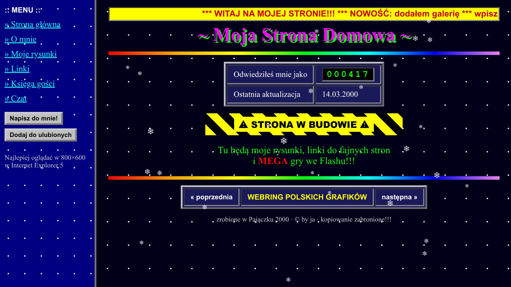
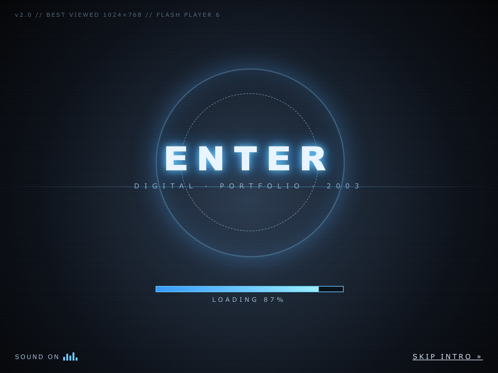
For everything else, many years went by before Wikipedia started to replace the PWN general encyclopedia that took up a bookcase and a half. Company websites didn't interest me much. The site I visited most in those days was newgrounds.com. All of that changed the moment I discovered deviantART and its Polish twin, digart.pl. One day I was given a paper copy of Computer Arts UK, and that moment has stayed with me ever since.
The Computer Arts covers from that period are a great cross-section of the trends, and a testament to very high craft and far greater variety. In advertising graphics alone, even without photography, a lot was happening, and scrolling through those covers today I get the feeling that more styles were "allowed" at once, compared with the minimalist unification we've submitted to in recent years. I also get the impression that back then the people designing application interfaces were much closer to the people designing promotional sites, and far more often they were the same person. In the end it's only an impression, because I honestly have no idea today whether seriously badass campaign promo sites are still made at a scale that keeps a market alive, or whether they're now just a rare flash in a dark sky.
That's also why I suspect the wider spread of a more creative approach to user interfaces didn't come only from unexplored horizons. I'd even say the opposite: most of the designers whose work, from where I stood, shaped the trends of the time were classically trained in applied design and/or drawing and composition. Most designers back then felt that the frames inherited from print, before the move to screens, were tight but reliable. They gave the right foundations for basic solutions without blocking creativity through too much complexity. That goes for the common methods and the layouts they produced, from grid-based and tile-based to the 980 layout, fluid layouts, the feed, the newspaper, the wiki and the kanban board, and for the building blocks themselves: HTML, CSS, JavaScript and, to a large extent, Flash.

Flash deserves a mention. Maybe we did need that one forever-too-loud, loudly dressed uncle after all? Fencing off creativity "above and beyond" into a web applet made a useful division, and made it easier to take in knowledge depending on what we were aiming for: clean, working interfaces, or creative expression through interaction.
Take Away the Paint
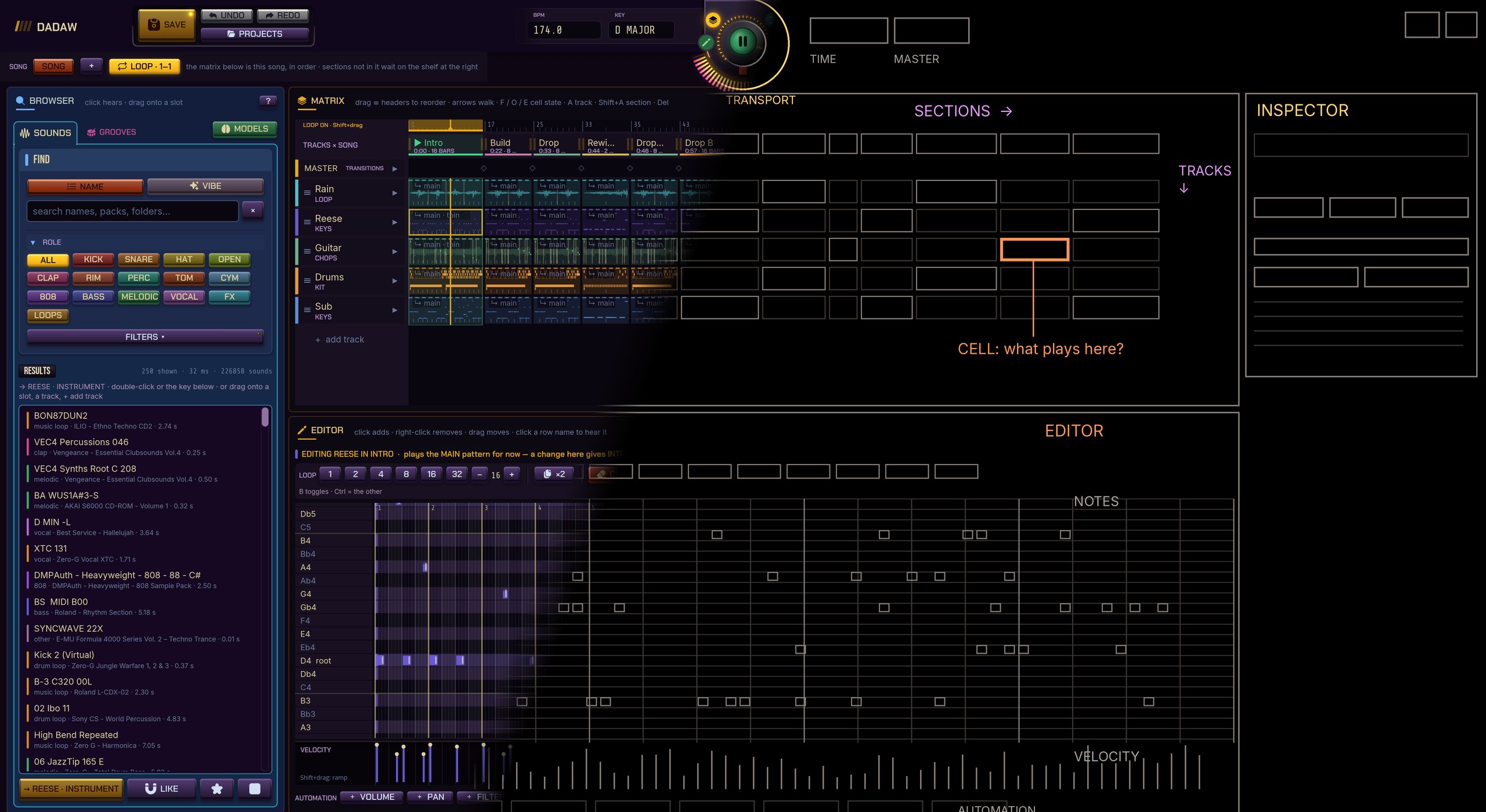
In the end I want to focus on the functional layer, and on applications for getting specific tasks done. I also very much hope this pushes the designers of applications with huge audiences toward a better understanding of, and more weight on, personalisation. Let's put on a filter that removes the visual layer and, for a moment, look at how a few applications have solved things over the years.
It's natural to assume that design should get better with every iteration. It's also natural to assume that the best functional design is invisible to the user, meaning so natural to use that it becomes an extension of the act. On that road, though, you shouldn't expect accessibility. An interface that is the best tool in functional terms becomes specialised, and its buttons stop being obvious. Which, again, contrary to popular belief, doesn't mean the chains of steps needed for a given task get more complicated. Quite the opposite. A good example, one that can open a whole new perspective for an interface designer, is VIM.
VIM: Grammar Instead of Buttons
I use it every day, and in editors that aren't VIM the first thing I do is switch on vim mode. It isn't about loyalty to a tool, nostalgia or belonging to the tribe whose members ask "have you tried exiting vim?" under every programming video. It's that VIM is the purest example of an interface that is completely inaccessible to a new user, and invisible to someone who has spent a few weeks in it. Invisible in exactly the sense I meant above: an extension of the act.
The first time you open VIM there's nothing there. A black screen, a few tildes down the margin, a cursor. No toolbar, no menu, no "save" button. You type a letter and nothing happens, or something happens that you didn't want at all. It's the blank page in its most literal form, and most people close the terminal at this point (if they know how) and never come back.
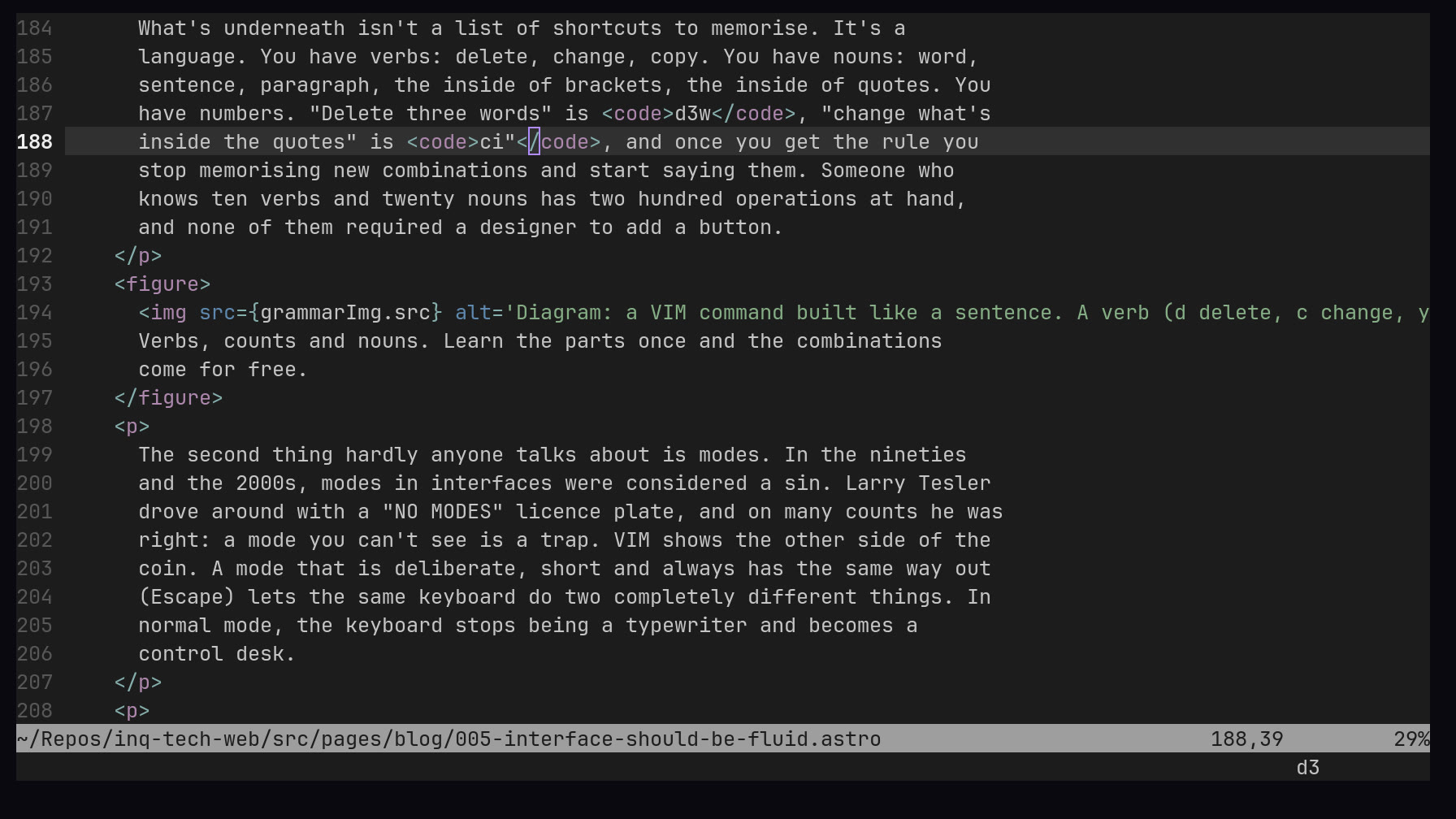
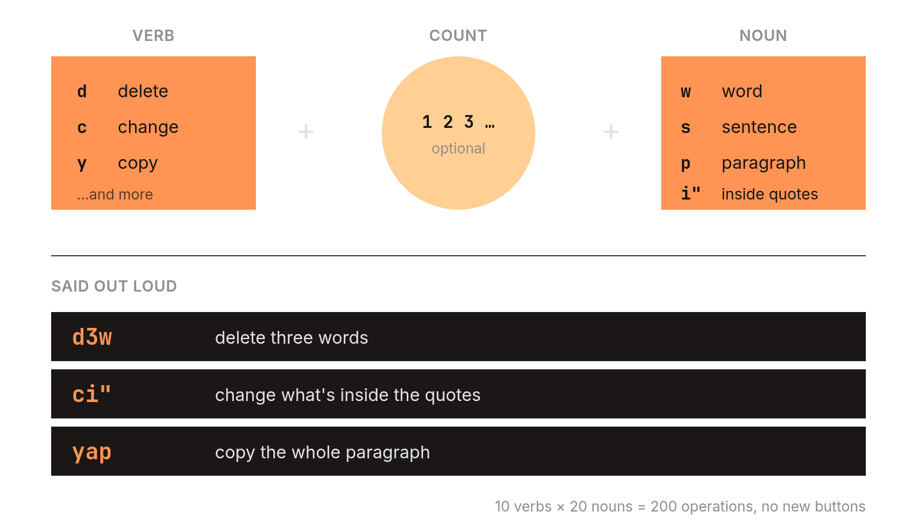
What's underneath isn't a list of shortcuts to memorise. It's a
language. You have verbs: delete, change, copy. You have nouns: word,
sentence, paragraph, the inside of brackets, the inside of quotes. You
have numbers. "Delete three words" is d3w, "change what's
inside the quotes" is ci", and once you get the rule you
stop memorising new combinations and start saying them. Someone who
knows ten verbs and twenty nouns has two hundred operations at hand,
and none of them required a designer to add a button.
The second thing hardly anyone talks about is modes. In the nineties and the 2000s, modes in interfaces were considered a sin. Larry Tesler drove around with a "NO MODES" licence plate, and on many counts he was right: a mode you can't see is a trap. VIM shows the other side of the coin. A mode that is deliberate, short and always has the same way out (Escape) lets the same keyboard do two completely different things. In normal mode, the keyboard stops being a typewriter and becomes a control desk.
The third, and maybe the most important for this essay, is
.vimrc: the file where, over the years, you write yourself
down. Anyone who uses VIM long enough has a different editor from
everyone else, even though they all use the same program. Nobody along
the way asked the user "are you sure you want to change this
setting?". The interface assumes you know what you're doing, and if
you don't, you'll find out. You pay for that assumption at the start,
in frustration, time and searching. But you pay once, and it pays you
back every day.
Users aren't afraid of the blank page, as long as they get a language instead of a menu.
I'm not saying every program should look like VIM. I'm saying VIM is proof that you can build a tool that isn't afraid of the blank page, and that users, at least some of them, aren't afraid of it either, as long as they get a language instead of a menu.
A Furnished Studio and an Empty Workshop
Every day I work in two worlds of creative software that are the best opposites I know: Adobe and Blender. Both are professional tools, both have an enormous number of features, both let you customise your workspace. The difference is in where they start.
Photoshop, Premiere and After Effects start from a studio someone else furnished. The panels have their places, the workspaces have names (Photography, Painting, Editing, Color) and you can rearrange them and save your own, but you always feel you're moving furniture around in someone else's flat. For years Adobe kept adding panels, dialogs, "new experiences" and start screens, and for years I kept adding actions, shortcuts and layouts of my own to get back to how I used to work. At some point I noticed I was putting more energy into keeping my studio usable than into the work itself. That was one of the reasons (along with the subscription and Linux) that today I open Affinity instead of Photoshop.
Blender has exactly the opposite history. For years it was a byword for an inaccessible interface: right-click to select, menus where nobody would look for them, hundreds of shortcuts. On every 3D forum people said Blender is free, but you pay for learning it with your sanity. Version 2.80, in 2019, changed a lot: left-click select by default, workspaces in tabs, menus put in order. It did that without giving up what had always been brilliant about Blender: any area of the screen can be any editor. You split the window, and in a corner you swap the 3D view for a curve editor, a file browser, a node editor or a Python console. Blender doesn't give you a studio. It gives you an empty workshop and walls to hang whatever you like on.
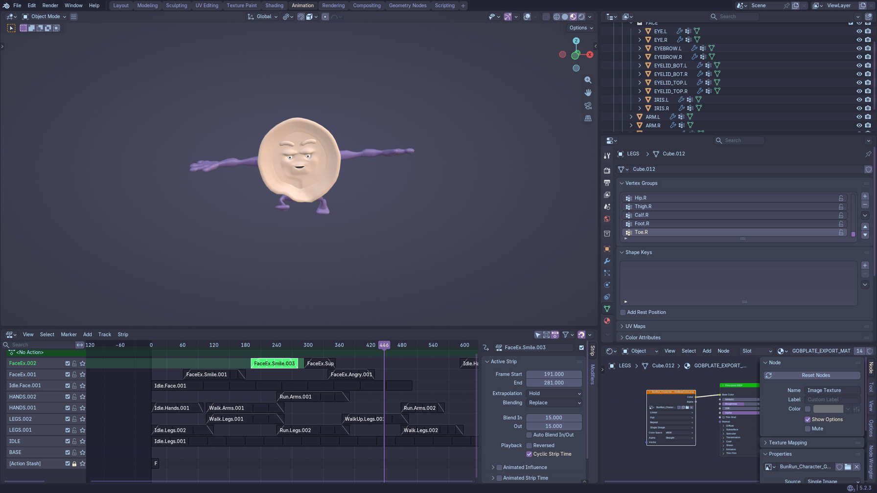
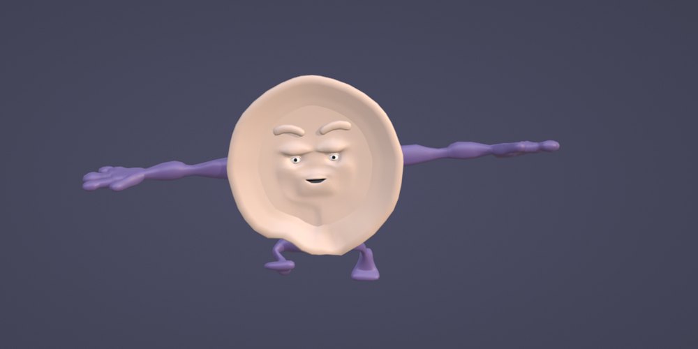
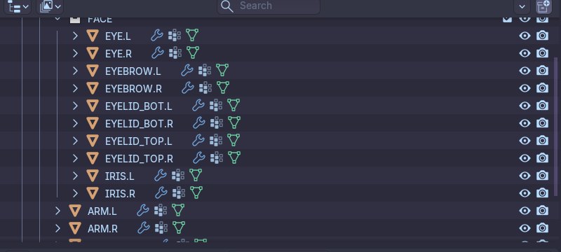
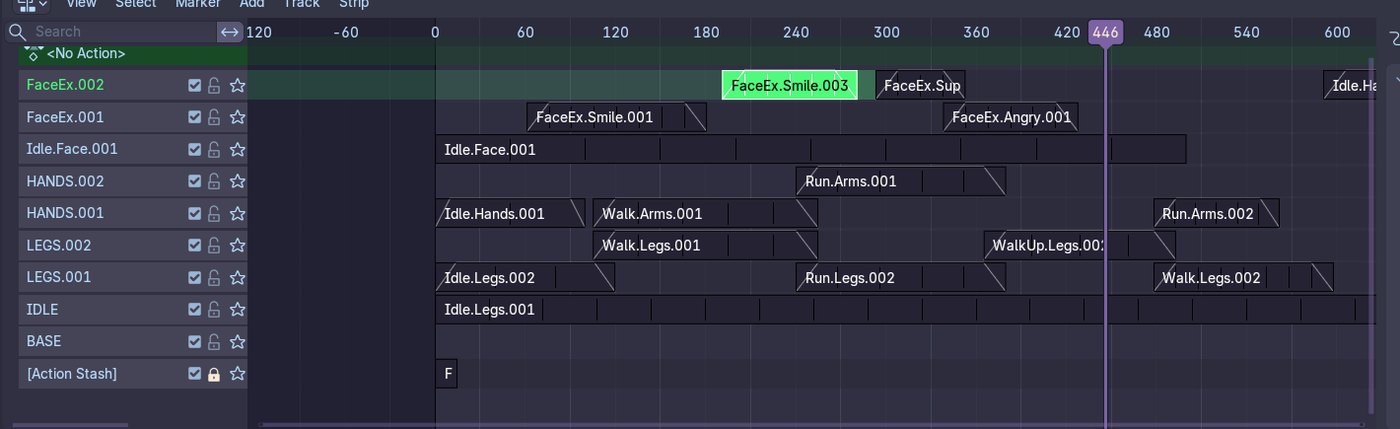
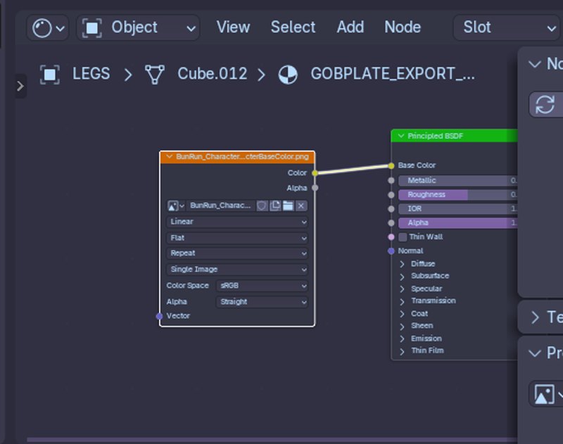
What interests me most is the direction these two worlds are moving in. Over the last few years Blender has become more approachable without losing its fluidity. Adobe has become more "approachable" by adding layers of hand-holding, welcome screens, suggestions and cloud, but the tools haven't become more fluid for it. They've become heavier. So you can build an interface that welcomes a beginner without taking anything away from an expert. You just have to want to, and you have to not be afraid that someone will get lost in the empty space.
One Layout for Everyone
Let's step out of the creative studios for a moment and into the apps everybody uses, because that's where the mechanism is easiest to see.
In 2007 Microsoft Office replaced its menus and toolbars with the Ribbon. The decision rested on a huge amount of data about what people actually use, and for the average user it was probably right: features became visible, grouped and labelled. But with the menus went the toolbars people had spent years arranging for themselves, and the first version of the Ribbon could barely be customised at all. The ability to rearrange it came later, once people complained loudly enough.
First we take something away, then we give it back in a smaller dose.
For seventeen years the iPhone wouldn't let you put an app icon wherever you wanted on the home screen. Icons always fell to the top left of the grid, like Tetris blocks. Android has allowed it since the beginning, and it caused no disaster. Nobody got lost on their own screen. When Apple finally allowed it, it was presented as something new.
In 2024 Figma showed a new interface with panels floating over the canvas. Designers, people whose job is interfaces, reacted badly enough that before the official release the panels went back to their fixed places at the edges of the window. It's an interesting case because it cuts both ways. Nobody asked users whether they wanted the change, but the users, including the most advanced ones, turned out to fear changes to their canvas more than anything else.
And finally Notion, which may be the best example of the blank page itself. Notion is close to a literal empty page: a new document, a blinking cursor, and a slash that opens a list of everything you can do. The tool is incredibly fluid. You can turn it into a database, a kanban board, a wiki, a journal or a CRM. And what grew up around it? A huge market for templates. People pay other people to fill the blank page for them and arrange their furniture. I think that says more about how we relate to empty space than any study.
The Loop
Which brings us to the title. Who got scared of the blank canvas first, the designers or the users?
I don't think the question has an answer, because it's a loop. Large product teams look at the data and see that most people never change the defaults, that with a lot of freedom some users get lost, and that every option costs support, testing and documentation. The conclusion looks obvious: take the options away, set everything up for them, make one layout that works for everyone. Users, meanwhile, raised by generation after generation of apps where nothing can be moved, stop expecting that anything can be moved. So when they meet a tool that gives them freedom, the freedom looks like work rather than possibility. The data shows that nobody changes the settings. The teams remove more settings. And round it goes.
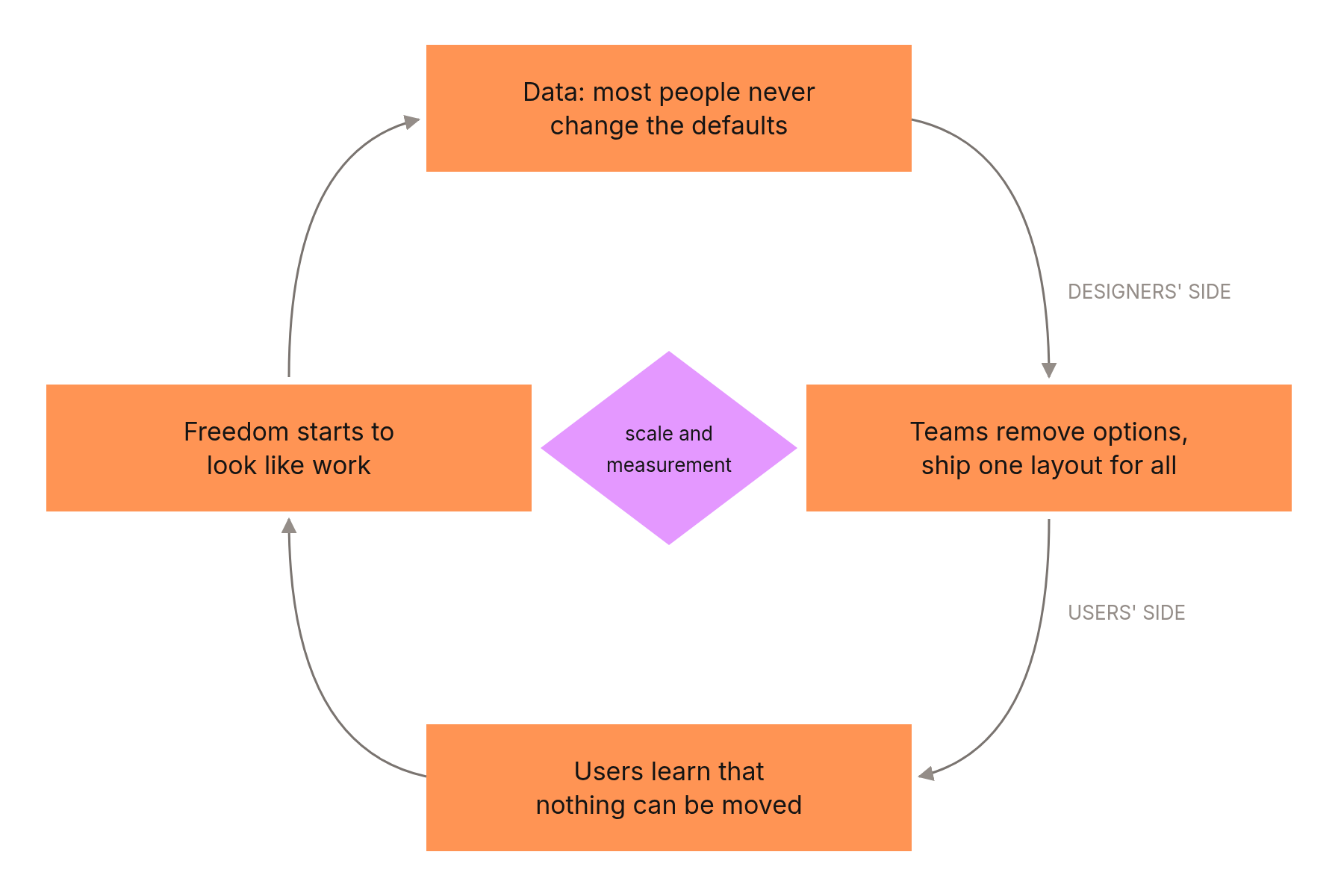
Add two more things. The first is scale: an app with a billion users can't afford to let a few percent of them get lost, because a few percent is tens of millions of people and tens of millions of support tickets. The second is measurement: what's easy to measure, how many people reach the goal on the first try, beats what can't be measured, how much a tool has become part of someone's hand after a year.
Approachability fits into a quarterly report. Fluidity doesn't.
The result is the minimalist unification I mentioned with the Computer Arts covers, only moved from the visual layer to the functional one. Not only does everything look the same, everything works the same, and works the same for everyone. For someone who uses a tool once a week, that's convenience. For someone who spends eight hours a day in it, that's a ceiling.
Building Our Own
For a few months now I've been building our own tools at KREATURA, our creative studio. DADAW is a sampler and sequencer we make our music in. MONTADA is an editing suite where we cut video for our short-form content and music videos. Both are written in Rust, and both are built largely with the help of AI, which matters for this essay, and I'll come back to it.
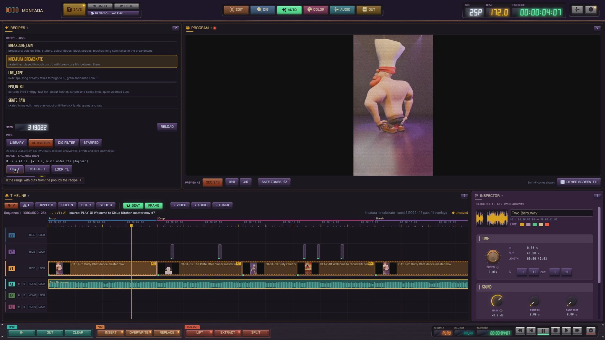
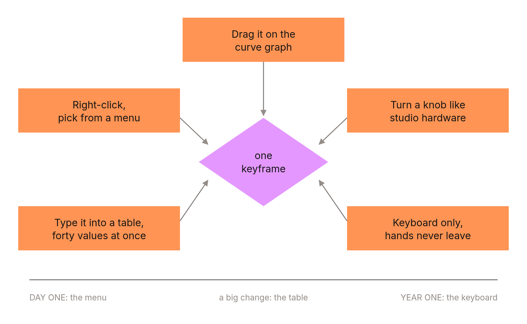
With MONTADA I wrote down one rule at the very start, and over time it became the most important rule of the whole project: every feature must be reachable by several paths, for different ways of thinking. You can drag a keyframe with the mouse on a curve graph. You can set it with a knob that looks and behaves like a knob on studio hardware. You can do it with the keyboard alone, without lifting your hands. You can type a number into a table, like in a spreadsheet. And you can right-click and pick it from a menu. None of these paths is the "right" one, and none is "for advanced users". On day one you reach for the menu, after a year your hands never leave the keyboard, and on the day you need to set forty values at once you open the table. It's the same program, growing with you instead of choosing for you which of those moments matters most.


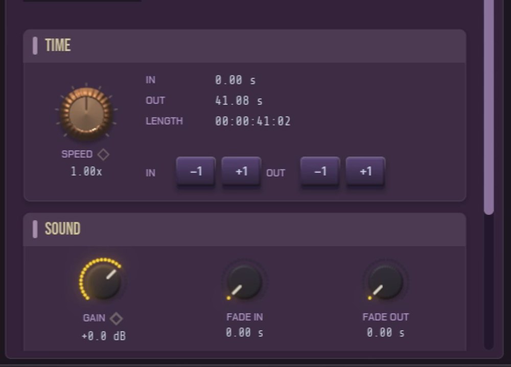
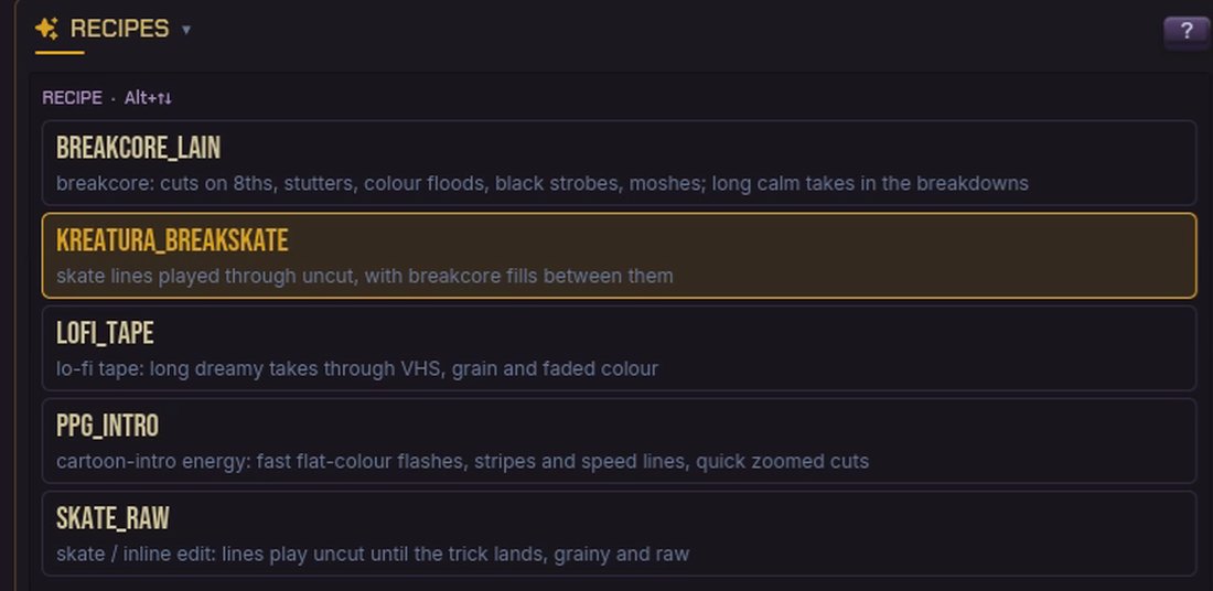

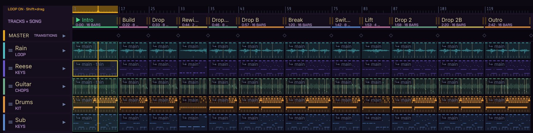
With DADAW, what taught me the most was something else: vocabulary. At some point I noticed I was calling the same things by different names in different places, and that this wasn't cosmetic. If something is a "part" in one place, a "section" in another and a "fragment" in a third, the user will never build a map of the tool in their head. So I wrote a glossary where every concept has one name and one name only (track, section, song, pass, effects), and from then on the interface started to fall into place by itself. It's the same lesson as VIM: a fluid interface isn't an interface with lots of options. It's an interface with a language those options can be said in.
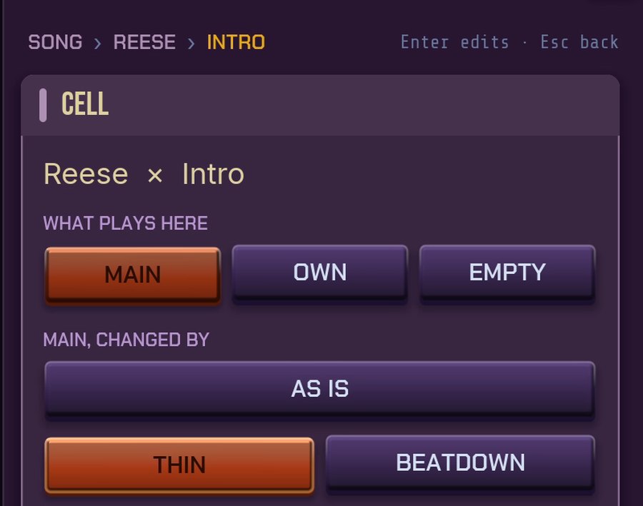
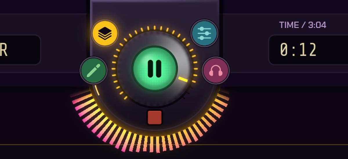
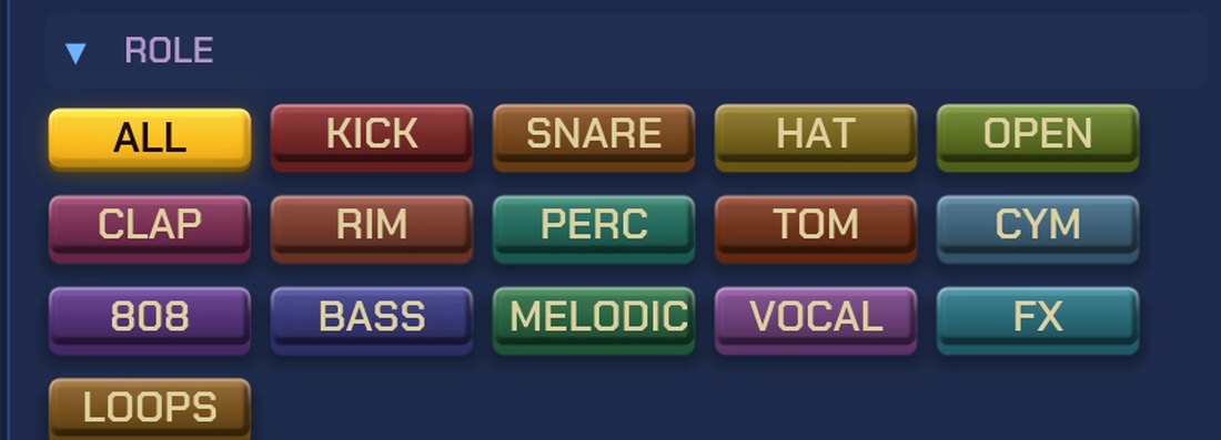
The third thing is scenarios. Before I call a piece of interface finished, I write down step by step how someone (me, a teammate, a person who has never seen the program) does a specific task in it, and then I really walk through it, click by click. It isn't testing in the engineering sense. It's checking that the different paths to the same goal actually exist and actually get there.
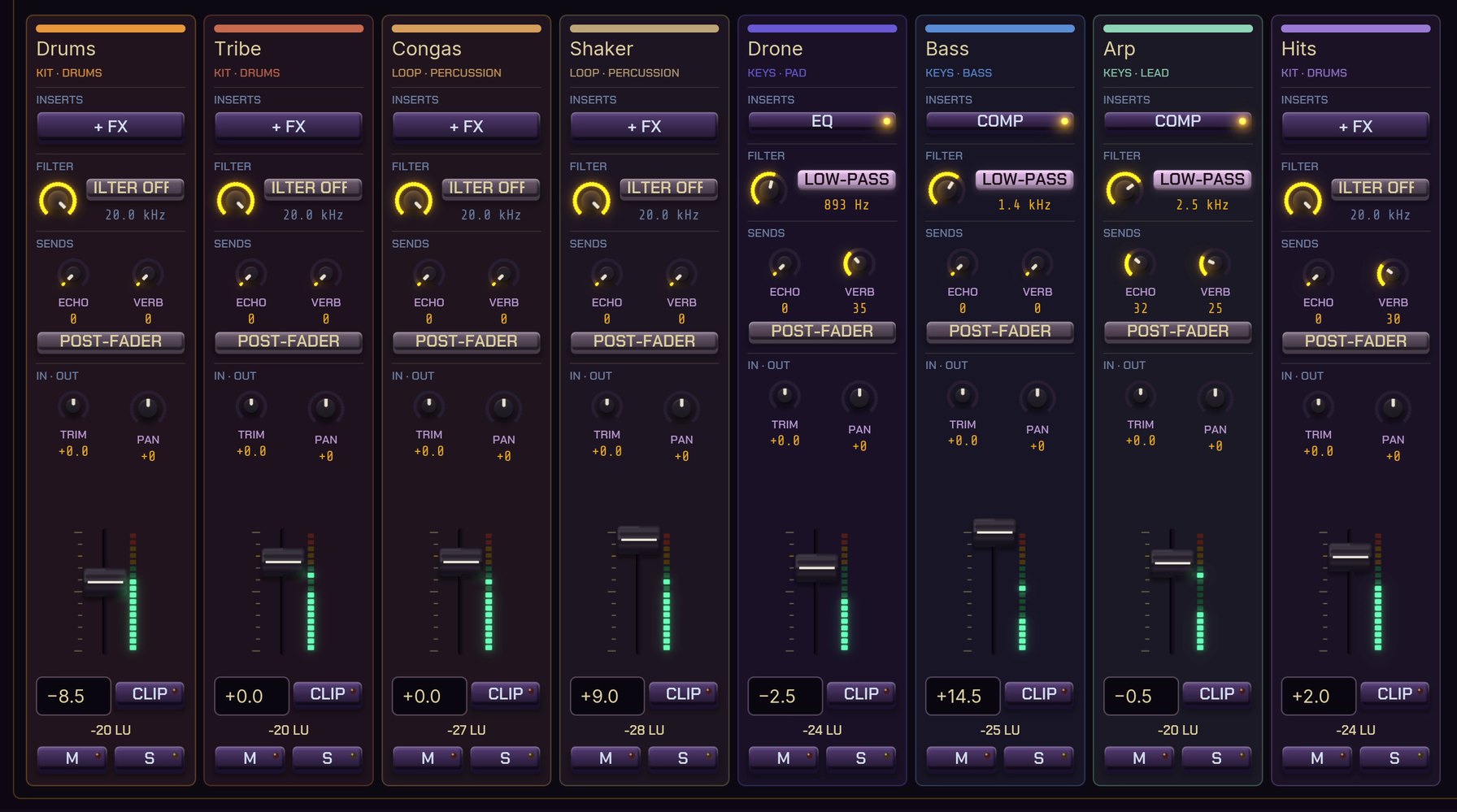
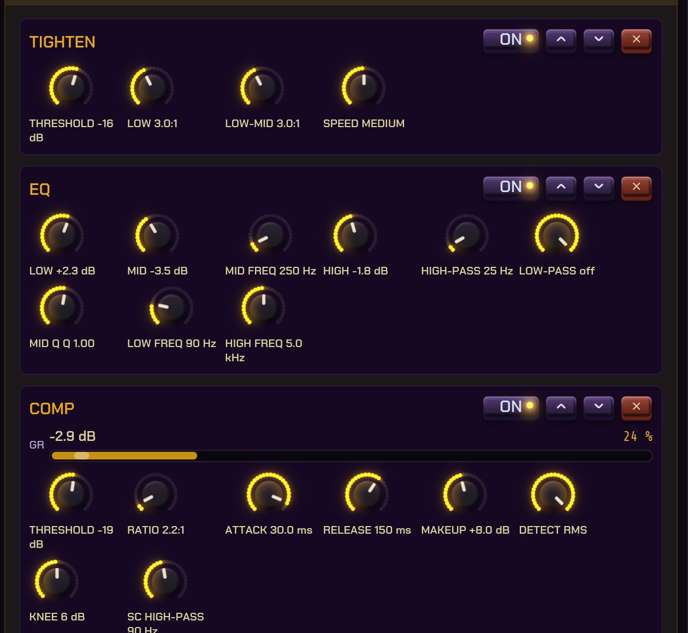
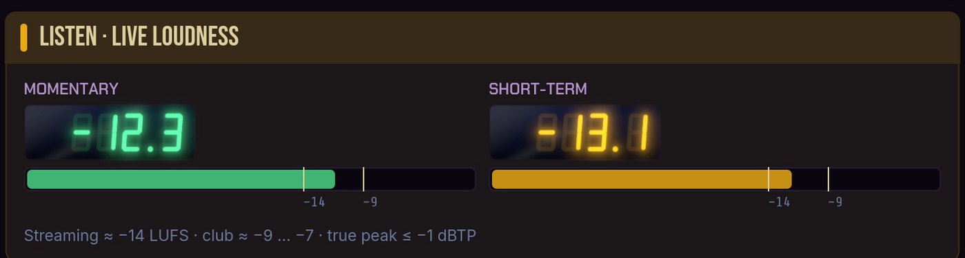
And now the promised AI. Until recently, building your own tools was a luxury of big studios. Pixar has its own, visual effects houses have their own, and a small studio had whatever it could buy and bent its work to fit the tool. That's changing right now. With language models, a small studio can build in a few weeks a tool cut to its own way of working, not to the average user from a report. In about a week and a half, using these tools, we made our first eight short videos, roughly two hours of usable music and a mastered EP. I'm not saying that to boast. I'm saying it because it changes the equation from the previous section. The argument "we can't give people freedom, because every option costs" gets weaker when the cost of an option drops by an order of magnitude.

There's a trap in it, of course. A tool cut perfectly for one person is, for everyone else, exactly as inaccessible as VIM is to someone opening it for the first time. That's why I hold so tightly to the rule of several paths. It's how a tool can be mine without being only mine.
Fluid
So what does it actually mean for an interface to be fluid? It doesn't mean every program should be a blank page, or that defaults should be thrown out. Good defaults are like a well-laid table: you can sit down and eat straight away. The point is that the table shouldn't be bolted to the floor.
Trying to boil it down to a few points I can remind myself of on the next project:
A language, not just buttons
If features can be combined like words in a sentence, users will find the ones you never planned for.
More than one path
Every action should have a way in for the mouse, the keyboard, a typed number and a menu, and none of them should feel like a punishment.
Defaults are a start
Not a verdict. Whatever you arranged for the user, they should be able to rearrange, save and take with them.
One name per thing
Call things the same everywhere. One concept, one name.
Listen to the few
Don't remove a freedom just because the data says nobody uses it. The minority that does is often the people who spend the most time in your tool.
Empty isn't bare
Empty space can hold hints, examples, a starting point. What matters is that you can throw them away.
Back to where this started, to iframes, marquee tags and animated cursors. Those pages were ugly, often unreadable and almost always overdone, but they had one thing that's missing today: nobody assumed there was one right way. A blank page in Pajączek wasn't a threat, it was an invitation. I think that feeling is worth getting back to. Without the snow on the page this time, but with the same nerve to leave the user a little room.